Anna Anders is a video artist who projects her work on strange surfaces to create new environments. In the work below she made a video of a bunch of people looking down as spectators, and when it was installed in the gallery it looked as though the art patrons were being watched.
Sunday, September 28, 2008
My Faves part 1
Above and below are images from "Close to Home: An American Album", collected photographs which were in a show at the Getty.
Offensive (?) Art and Photography
I think it is really difficult for anyone to create or photograph anything that my generation will find universally offensive. Are we desensitized to it? Am I personally on the liberal side and will accept just about anything as 'freedom of expression' and as 'art'? I also have a hard time remembering things which I find offensive- I view a lot of artwork and photographs while I work at the art library, and I certainly see things I don't like or don't agree with, but I often put the book down before I've registered it as 'offensive' (which, I suppose, could be labeled as me being closed-minded?). What is the difference between something that is grotesque and something that is offensive? Art can be offensive on the surface, but once we look closer we see the intent behind the work and the reason for its uglyness or disturbing nature, it becomes powerful rather than offensive. (Above: scanned from "Art in the Age of Terrorism": an asylum seeker in the Netherlands sewed his eyelids and mouth shut in protest of the government asking people with asylum to leave the country)
Above: from a book called "Close to Home"- found photographs from Americans in the 20th century. I find this moderately personally offensive.
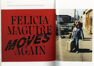
Above: Ken Lum documents the homeless. This seems insensitive at first glance, but the trivializing of what must be a traumatic lifestyle for a young girl is actually quite effective artistically.
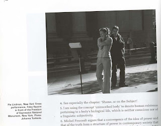
Above: Pia Lindman studies journalistic photographs of people grieving in war torn countries, etc, and re-enacts them in public places. Insensitive to the private emotions of the victim's families? Or is she protesting against war and tragedy itself?
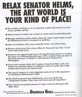
Above: a poster by the Guerilla Girls (an art group) protesting unfair female and minority representation in the art world. Not exactly tactful, but effective.
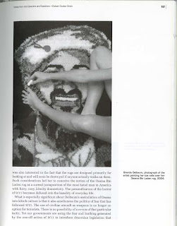
Above: Brenda Oelbaum created a loop-rug depicting Osama BinLaden's face, and then photographed herself painting her toenails on top of it. Imagine how offensive this would be to one of his supporters.
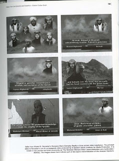
Above: Khaled D. Ramadan's video "Someone Else's Everyday Reality" uses a propaganda video made by terrorists which commemorates suicide bombers from the 9/11 attacks.
The books that these images are from are all on my carrel (#24) in the art library. You are welcome to come by and take a look.
Saturday, September 27, 2008
Favorites from Postsecret
To the above secret, someone commented: "you are working, you just aren't at the right job yet."
In case you don't read postsecret religiously already: http://postsecret.blogspot.com/
More Source Book
Jessica Bruah creates narratives in her work that force you to come up with explanations for what is happening. Very intriguing. http://jessicabruah.blogspot.com/ (above and below)
(below: repetition)
(below: repetition)
This is Koutama Bouabane. He did a series using letters made of ice and photographed them as they melted. http://www.kotamabouabane.com/ (above: variety below: asymetrical balance)
Labels:
design elements,
jessica bruah,
koutama bouabane,
source book
Most Important Photograph
The most impact photography has ever had on me was when I was about 15 and went to the Los Angeles County Art Museum with my dad. We were visiting my great grandmother who lives nearby, and it is a tradition to always go to the museum while she takes a nap. There just happened to be a retrospective of Diane Arbus on display and we went to see it. I had never heard of Diane Arbus, but her work immediately impacted me. It was ugly and truthful and shocking but I instantly was drawn to it because she was photographing things that humans are universally so curious about. Not only the strange 'outsiders' type of photographs, like "Jewish Giant at Home with his Parents" (below), but photographs of how people relate to eachother (like the photo of a young couple, above). When we look at her photographs we get to have a slice of what it is like to be someone else. Her work is voyeuristic but not in an uninvited way, which I think separates her from other artists. After seeing the show I was left with an entirely new impression on what photography means as an artistic medium.
Tuesday, September 16, 2008
Fischerspooner
You may have heard of the band Fischerspooner or listened to their music, but don't be fooled- that is only half of what/ who they are, which is really a performance art piece. They are represented by Deitch Projects in New York. (above: vertical balance) (above: symmetrical balance)
Please check out their videos, I am really obsessed. They are really weird: http://www.fischerspooner.com/ and their flickr page http://www.flickr.com/photos/fischerspooner/
Labels:
design elements,
fischerspooner,
source book
Illustration
One of my all time favorite artists is Maira Kalman. Her most recent work was for the New York Times Online- a blog called "The Principles of Uncertainty". I bought the book made of it. It is absolutely wonderful.
Below is a work by an illustrator named Tina Berning. I think this illustration was for the New York Times?
Above is an illustration by Sam Weber.
Labels:
jillian tamaki,
maira kalman,
sam weber,
source book,
tina berning
Other
Jillian MacDonald (from a performance piece called "Horror Makeup" in which a woman applied grotesque stage makeup to herself while on the subway- just like some women put on their normal makeup on the way to work in the morning). I love this. (asymmetrical balance)
This work, "Father" is a painting (!) by a 20th Century artist named Luo Zhongli. This portrait was very famous and was quite unsettling when it was made because it shows a decrepit old man who suffered in the turbulent Mao era, rather than the less-than-truthful portrayals of the elderly common at the time . (horizontal balance)
Then, a few months ago, I saw this illustration by Brett Curtin (currently working), and the colors and elderly-looking fingers reminded me of the painting above. I don't know if there is actually any connection.
(symmetrical balance)
The above photo is from an italian fashion blog. I really like the lightbulbs. (repetition)
Labels:
brett curtin,
chen yifei,
jullian macdonald,
luo zhongli,
source book
Interesting Photos from the Sartorialist
The Sartorialist is the blog of a photographer who travels around the world and takes pictures of fashionable people on the street. Here are some of my favorites which I have saved.
I am really into white and cream together (below).
Wish this Italian guy were my grandpa. (below)
I really just wanted this girl's shoes.
http://thesartorialist.blogspot.com/
I am really into white and cream together (below).
Wish this Italian guy were my grandpa. (below)
I really just wanted this girl's shoes.
http://thesartorialist.blogspot.com/
Labels:
photo,
source book,
the sartorialist,
white and cream
Sunday, September 14, 2008
Vanessa Beecroft
Vanessa Beecroft is a very bizarre performance artist, photographer and painter. Most of her pieces generally include large numbers of women (sometimes semi-nude or wearing strange bodypaint) wearing high heels who stand or walk in the gallery until their feet hurt so much they can no longer stand. They slowly all sink to the ground and end up lying on the floor. The bodies are grotesque and alienated, and apparently watching the performances is actually quite boring since so little happens, but the photgraphs of the pieces are pretty interesting.
Thursday, September 11, 2008
More for Thursday
These two photos are by Luke Battern and Jonathan Sadler (working together) from a series they did semi-mocking stock images. They are of "Big Ten Co-Eds with Ski Masks,” “Preppy Girls with BB Guns,” and “The Lost Cheerleaders". The images were all published into a book available for more looking here:http://www.photoeye.com/bookstore/mshowdetailsbycat.cfm?catalog=TR187
Labels:
jonathan sadler,
luke battern,
photo,
source book
Subscribe to:
Posts (Atom)